God of Sports
Curiosity leads to changes.
God of Sports was more than an online store—it was a movement. Aimed at creating access to premium, performance-driven sports gear, the brand needed a bold, future-ready identity to match its ambition. The ask? A brand that could stand out on shelves, screens, and sports courts.
12Grids stepped in to translate this vision into a brand system that was not only visually striking but emotionally resonant.


We Present
AUTHENTICITY
COMMUNITY
PERFORMANCE
PASSION
INNOVATION
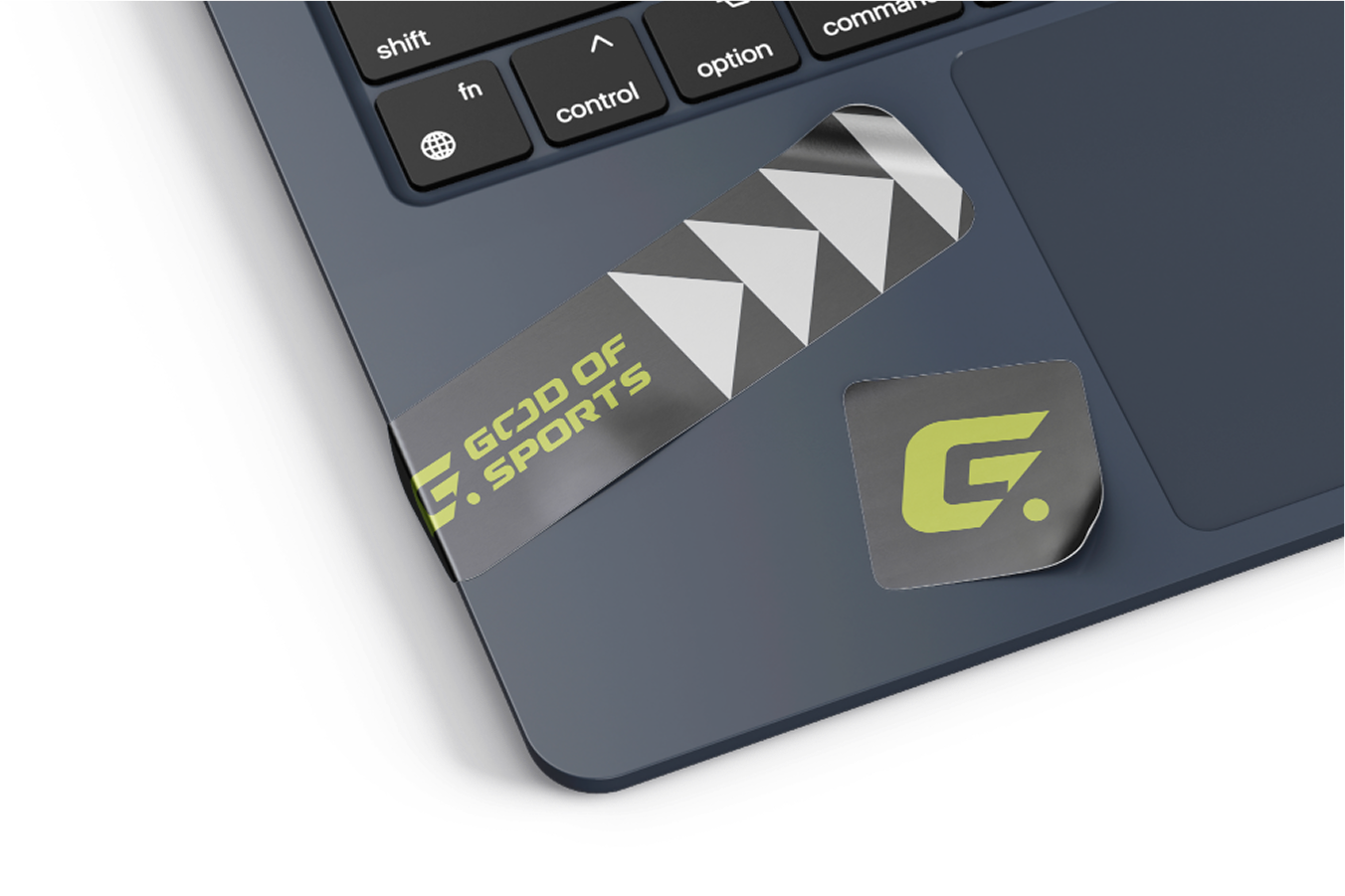
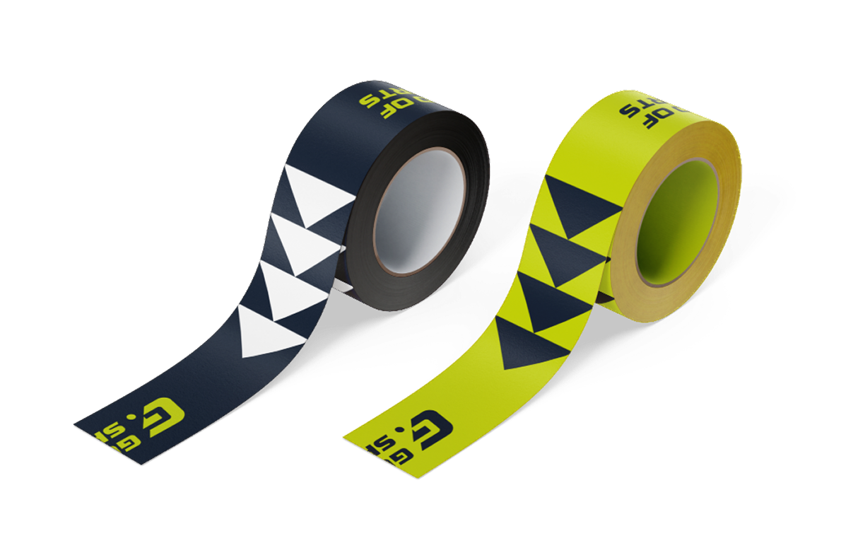
PATTERNS
We created a bold set of graphic patterns inspired by speed, power, and symmetry—core attributes of athletic performance. These patterns serve as a visual metaphor for energy in motion, designed to give GOS a recognizable design DNA across all brand assets.
From clean linear motifs to aggressive angular overlays, the patterns bring depth, attitude, and continuity to the GOS brand—ensuring every touchpoint feels alive, energetic, and unmistakably GOS.


IT AIN’T OVER TILL IT’S OVER
Color Palette & Typography
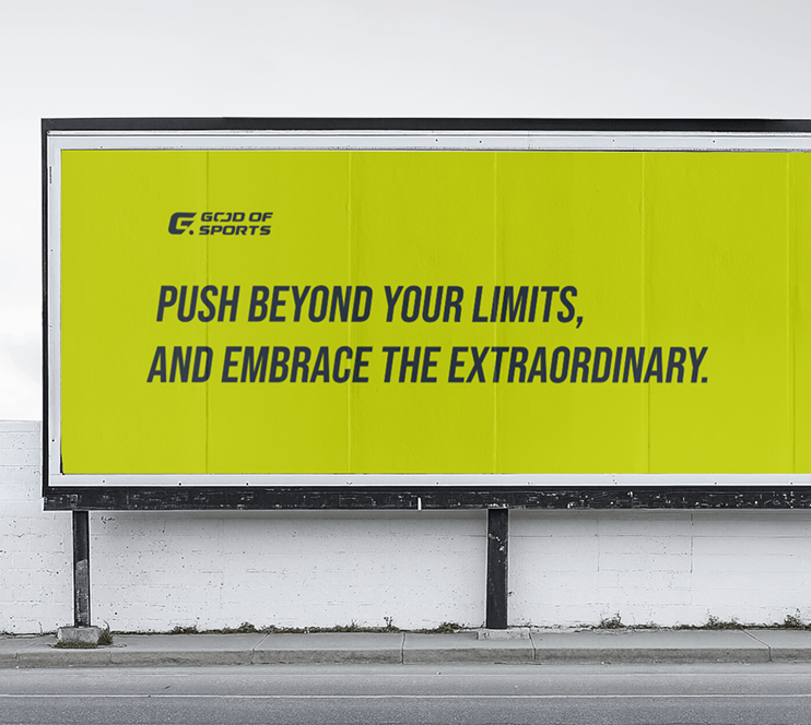
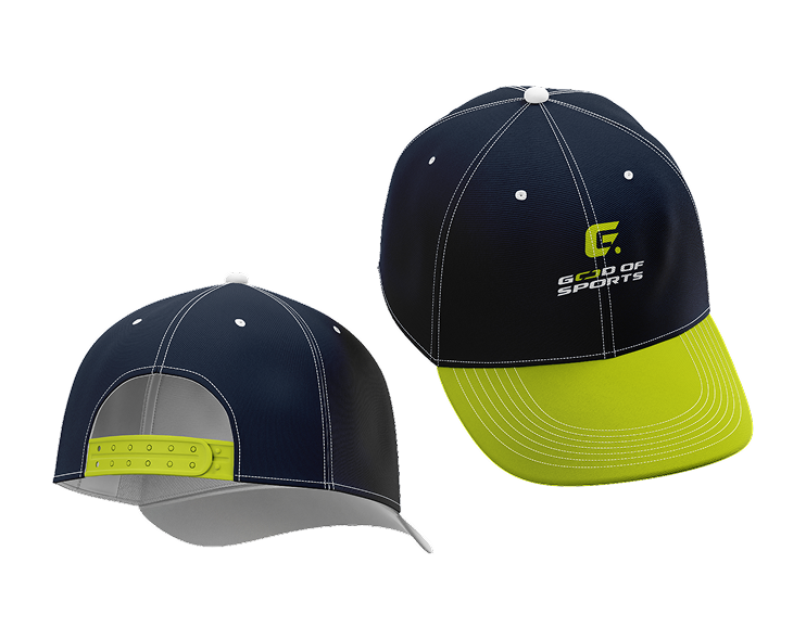
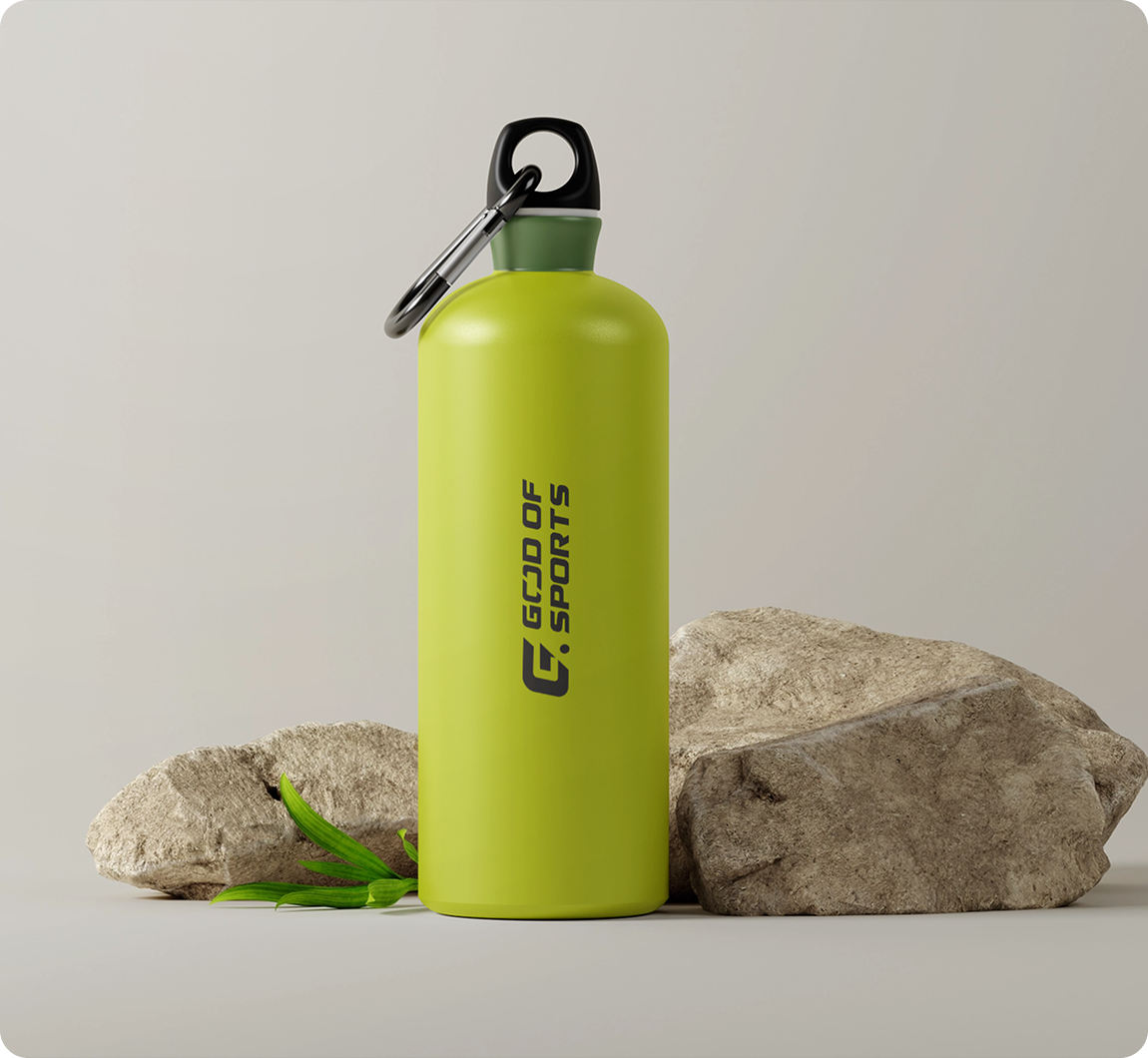
The GOS palette is a powerful mix of electric neons and grounded neutrals. We used a bold lime green to symbolize energy and youth, paired with deep black and white for structure, confidence, and balance. The result is a look that feels fresh, edgy, and built for modern athletes.
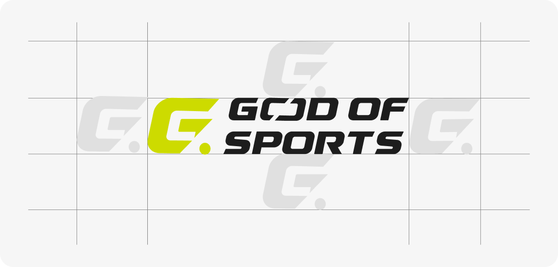
We chose a bold, athletic typeface that’s both functional and commanding. It was important for GOS to look strong on a jersey, yet clean on a screen.
Headlines use a wide sans-serif type to reflect boldness and clarity.
Body text is lean, minimal, and optimized for readability across web and print. Typography is not just visual—it's a tone. GOS speaks with confidence, speed, and directness.