


Web Design
7 Best Restaurant Websites You Must See
4 mins | 08 Nov 2023
_e063e64e.jpeg&w=2048&q=75)
Table Of Content
2. The Importance of a Well-Designed Restaurant Website
Introduction
The saying "You eat with your eyes first" holds, especially in the world of restaurant websites. The design of your restaurant's website can significantly impact whether someone chooses to dine at your establishment or move on to the next option. A well-designed restaurant website not only showcases your culinary offerings but also creates an inviting online experience. In this blog, we'll explore some of the best restaurant website designs, highlighting what makes them stand out and how these designs can be a source of inspiration for your culinary venture.
The Importance of a Well-Designed Restaurant Website
Before we dive into the nitty-gritty of designing a restaurant website, let's understand why it's essential. A well-designed restaurant website serves multiple purposes:
- First Impression: Your website often serves as the first point of contact with potential customers. A visually appealing and user-friendly site can make a lasting impression.
- Information Hub: Your website is the go-to place for customers to find information about your menu, hours, location, and special events.
- Brand Image: It's an extension of your restaurant's brand identity. The design, colours, and content should reflect the ambience and style of your establishment.
- Reservations and Orders: A well-designed website makes it easy for customers to make reservations or place online orders, thus increasing revenue.
- SEO and Visibility: A well-optimized website can improve your restaurant's search engine ranking, making it easier for potential customers to find you.
There are so many key elements you must note down while setting up to make your Best Restaurant Website Design
7 Best Restaurant websites you can learn things from
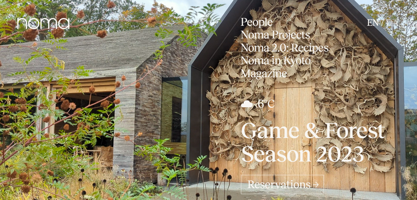
1. Simplicity is Key: Noma
Noma, the famous two-Michelin-star restaurant in Copenhagen, Denmark, is renowned not only for its exceptional cuisine but also for its website design. The site embraces simplicity, aligning with the restaurant's philosophy of pure, honest ingredients. The design features a clean, white background with minimal text and a rotating gallery of enticing food images. The navigation is straightforward, making it easy for visitors to find essential information, such as the menu, reservation details, and contact information. The elegant simplicity of Noma's website leaves a lasting impression, mirroring the restaurant's culinary ethos.
Takeaway: Embrace minimalism, focusing on high-quality images and clear navigation to create an inviting online presence.
2. Storytelling through Imagery: Gaggan
Gaggan, a Michelin two-star restaurant in Bangkok, Thailand, utilizes a bold and vibrant colour scheme to make a statement on its website. The homepage features amazing animation of counts and a relaxing blue theme, making the user feel like it's a storytelling journey. The clouds on the homepage have six senses, each consisting of the amazing things that food might experience. Text and graphics create a visually striking effect. The site incorporates unique fonts and typography to match the restaurant's avant-garde style. Despite the unconventional design, Gaggan's website is easy to navigate, ensuring that potential customers can quickly access menus, reservations, and other vital information.
Takeaway: Effective use of colours and typography can help your website stand out and reflect the restaurant's personality.
3. User Experience: The French Laundry
The French Laundry, a renowned three Michelin-star restaurant in California's Napa Valley, excels in user experience through its website design. The homepage is dominated by a captivating image of the restaurant's exterior. Navigation is intuitive, with a prominent reservation link and clear menu options. The website incorporates responsive design, ensuring a seamless experience across various devices, and loads quickly, enhancing user satisfaction. The French Laundry's website makes it effortless for visitors to access essential information, fostering a positive first impression.
Takeaway: Prioritize user experience by offering intuitive navigation, quick load times, and mobile responsiveness.
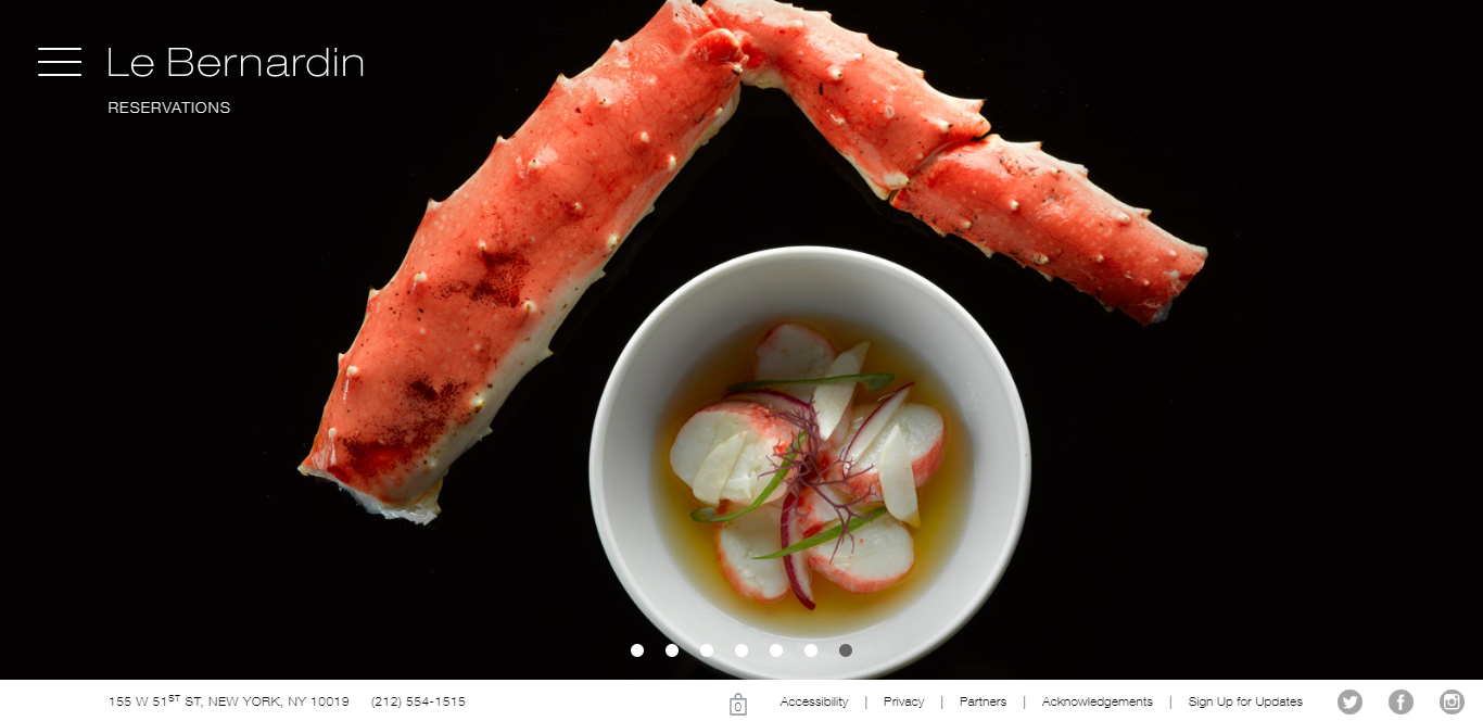
4. Immersive Design: Le Bernardin
Le Bernardin, a Michelin three-star seafood restaurant in New York City, uses its website to create an immersive experience. This unique design perfectly complements the restaurant's seafood focus. As visitors scroll down, they encounter visually appealing sections with a blend of high-quality images and interactive elements, such as the Chef's Tasting section that provides insights into the chef's daily creations. The website captures the essence of the restaurant's seafood offerings and upscale atmosphere. A user is always amazed by an infinite scroll website, and Le Bernardin has certainly been using that strategy. It's important to make sure your user doesn’t have to click on many CTAs to get somewhere. Just make it one click away
Takeaway: Create an immersive experience that aligns with your restaurant's theme or cuisine to engage and captivate visitors.
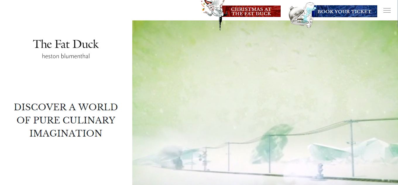
5. Effective Use of Colors: The Fat Duck
"The Fat Duck," a three-Michelin-star restaurant in Bray, England, excels in weaving a captivating narrative through its website. The homepage features a fullscreen video showcasing a storytelling video full of vibrant colours, allowing visitors to immerse themselves in the experience before even setting foot in the restaurant. Such engaging content not only captivates visitors but also encourages them to stay on your website longer, which can positively impact your SEO rankings
Takeaway: The colour scheme is carefully chosen to create a visual impact and evoke the desired emotions. When designing your restaurant website, consider a colour scheme that reflects your brand identity and the ambience of your establishment.
6. Photography and Emotion: Alinea
Alinea, a Michelin three-star restaurant in Chicago, Illinois, places a strong emphasis on photography to evoke emotions and desire. The website showcases a full-screen image as the background, giving viewers a sneak peek into the dining experience. High-quality images of the dishes, as well as the restaurant's interior, take centre stage. Each image is meticulously chosen to convey a sense of artistry and passion that matches Alinea's culinary philosophy.
Takeaway: High-quality, emotionally resonant images can make visitors crave your food and want to experience your restaurant.
7. Engaging Animations: Sketch
Sketch, a two-Michelin-star restaurant in London, takes a playful and whimsical approach to its website design. The homepage features interactive animations that engage visitors and create a sense of curiosity. As users scroll down, they encounter various sections, each with its own set of animations, making the website an enjoyable and memorable experience. The website's design is aligned with the restaurant's unique and artistic dining concept. If you visit “the Gallery” section, you can also play a fun game that helps in minimising the bounce rate of the website. It is an amazing idea for your website, too!
Takeaway: Use creative animations to engage visitors and make your website an extension of your restaurant's character.
Conclusion
A well-designed restaurant website can be a powerful tool for attracting and retaining customers. The best restaurant website designs share common elements such as simplicity, effective use of visuals, compelling storytelling, seamless user experience, and alignment with the restaurant's brand and cuisine.
By drawing inspiration from these outstanding examples, you can create a website that not only showcases your culinary offerings but also entices visitors to become valued patrons of your establishment. Remember that your website is often the first point of contact for potential customers, so investing in a well-thought-out design is essential for the success of your restaurant.
Author

Abhishek Sawant
Marketing Researcher
Share
Share
Related

Web Design
How We Built a Digital Ticketing System for Mumbai Zoo— A Government Case Study
7 mins : 20 Mar 2026

Web Design
Polymers, Innovation, And A Modern Website: The Goldstab Organics Journey
5 mins : 10 Nov 2025

Web Design
From Friction to Finish Line: The God of Sports Digital Transformation
6 mins : 17 Sept 2025
Other Articles
Web Design
Screen Sizes for Responsive Design: An Expert Guide
6 mins : 26 Apr 2024

Web Design
Responsive Web Design: Understanding The Basics For Seamless User Experiences
7 mins : 29 Apr 2024
Web Design
The Future Of Responsive Web Design: Emerging Trends, Innovations And Predictions In 2026
7 mins : 17 Feb 2026