


Web Design
Responsive Web Design: Understanding The Basics For Seamless User Experiences
7 mins | 29 Apr 2024

Table of content
2. What Is Responsive Web Design?
3. Importance of Responsive Web Design
4. Components Of Responsive Web Design
Introduction
Web development is an area that is witnessing continuous changes in this modern world, and one concept that stands tall as the cornerstone of user experience — Responsive Web Design! Picture this: you are browsing a specific website on your smartphone, seamlessly transitioning to your desktop and then to your tablet, all while experiencing the exact same level of aesthetic appeal and functionality. But, how is this possible? Enter responsive design!
In this digital stage, where device screens come in all shapes and sizes, the significance of responsive web design cannot be missed! Also, it's not only about fitting or making the website adaptable according to different screen sizes, but is also about developing a seamless and immersive experience for each & every individual, regardless of the device they choose!
Whether you're an experienced web developer aiming to refine your expertise or an inquisitive beginner eager to learn the basics, this blog will provide the understanding and resources necessary to confidently and skillfully tackle the complexities of responsive design! So, you need to buckle up and prepare to embark on a journey of understanding the basics of responsive web design. The key to website performance success is responsive web design, so let's start!
What Exactly Is Responsive Web Design?
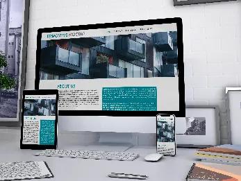
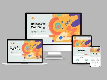
Responsive design, or responsive web design, can be defined as the ability of a website to adapt its layout and presentation depending on the screen size or device used by the user. This enables website visitors to see the content and website formats quickly & easily on different types of devices, such as desktops, laptops, smartphones, tablets, etc.
Responsive web design makes sure that a website performs appropriately across different windows as well as devices, improving usability. In addition to adapting to various devices, a responsive design website can also modify its layout according to the size of the window on a specific device.
For instance — If an online user splits the screen into multiple windows or resizes their browser window, they will still be able to view the images, texts or any other visuals on the website. This type of advanced design enables online users to make a change in the elements of their device screen as required to finish the tasks.
Read More: Top 15 Web Design Trends In 2024 That You Must Know About
Why Should You Utilize Responsive Web Design?
Here are a few important reasons why web designers, marketers or developers should ensure having a responsive web design; let's have a look:
a) Optimizes User-Experience: Responsive web design allows online users to go through a positive & seamless user experience on any type of device, such as smartphones, desktops, etc. With responsive web design, there would be no issues like long loading times, redirects, etc. Therefore, users will be able to access as well as navigate web pages stress-free and quickly.
b) Attracts More Customers: An effective user experience (UX) has the potential to maintain a significant amount of traffic on a company's website, resulting in better conversion rates, increased sales, and enhanced customer loyalty.
c) Brand Versatility: There are a lot of clients who prefer having a mobile version of their company’s website, and this is so because the number of smartphone users has witnessed a massive increase! Also, people like to surf the internet using their smartphones all the time. Responsive design helps in making a brand versatile, relevant as well as accessible to the users.
d) Optimizes SEO Rankings: Search engines might give prioritization to the mobile version of the website in search results rankings. This is the reason why it can be profitable for a brand to optimize the experience of the mobile version by implementing responsive design tactics.
e) Convenient Web Development: Making use of one code base instead of using different ones makes it simpler & easier to maintain websites for web developers, as they only need to update one set of code and content.
f) Easier To Access Information: Although certain consumers might possess only one kind of device, it's beneficial for a company to ensure equal accessibility to its website, irrespective of the user's device. This improves consumers' capacity to access online resources in an effective manner.
g) Stay Up-To-Date Of Technological Advancements: Web designers have the flexibility to incorporate additional breakpoints, specifically tailored to numerous device sizes whenever necessary, ensuring that responsive design websites remain compatible with evolving market technologies. This enables a company's website to remain aligned with the devices and preferences of present-day customers.
What Are The Main Components Of Responsive Web Design?
There are a lot of tools and ideas associated with responsive web design that web developers can utilize! In addition, having a clear understanding of the important components of responsive web design can help you to learn better how it actually works!
Here are the components that you need to
know about:
1. Media Queries — Media queries are known as filters that any website can utilize to find out the dimensions of the device. By making use of the media queries, understanding the dimensions can become simpler for the web pages. Additionally, it can even rearrange the content within the web page to be easily accessible across various devices.
2) Fluid Grid System — When it comes to fluid grid systems, they are the main feature of the responsive web design procedure. A fluid grid system enables the web developers to arrange data and also, design the website. When employing a non-fluid grid system, it implies that the positioning and interrelation of content remain fixed. Consequently, transitioning from a computer to a mobile phone may result in certain sections of the website being inaccessible on the screen! A fluid grid system enables the website to scale content on the basis of the space available.
3) Fluid images — Fluid images employ a similar concept to fluid grids. In responsive web design, they adjust according to the device's size. For instance, an image displayed on a large monitor might have more pixels when it is compared to the same image viewed on a tablet! Without resizing, the image could fill the entire screen when switching to the tablet.
4) Breakpoints — A breakpoint denotes a threshold where a web page transitions to a different layout! Varying pixel resolutions on computer, tablet, and mobile screens enable the website to identify your device accurately and tailor the content according to that! By utilizing media queries, any website will be able to determine the size of the device, and by utilizing breakpoints, the websites will be able to select the viewing option that has to be offered!
With Responsive Web Design, Get Ready To Enjoy Website Performance Success!
If you are thinking about building a responsive web design for your brand, you are taking a step towards catering to the requirements of every individual out there! As you put a responsive web design website, you might need the help of an industry expert, and we at 12Grids are here to happily assist you in your project!
You just ensure that your brand’s website is able to show up well on every device and that every individual goes through a positive & smooth experience whenever they visit your website! Having a responsive website means enhancing customer experience on the website.
This also helps in convincing your target audience or people in general to keep coming back to your website! When it comes to search engines, they will also be able to see that the website you have created is given authority in the related field!
As a consequence, it improves your search results rankings, increases the online visibility of your website, and ultimately, drives more traffic! Isn't that amazing? Contact us today to build a robust, responsive website for your company!
Key Takeaways
- Responsive web design ensures that websites can adapt seamlessly to different devices & screen sizes, including smartphones, laptops, desktops, etc.
- Responsive web design enhances user experience and accessibility across various devices.
- Continuous updates and improvements are crucial to keep up with evolving technology and user expectations.
Author

Ravindra Warang
Director - Strategy
Share
Share
Related

Web Design
How We Built a Digital Ticketing System for Mumbai Zoo— A Government Case Study
7 mins : 20 Mar 2026

Web Design
Polymers, Innovation, And A Modern Website: The Goldstab Organics Journey
5 mins : 10 Nov 2025

Web Design
From Friction to Finish Line: The God of Sports Digital Transformation
6 mins : 17 Sept 2025
Other Articles
Web Design
Screen Sizes for Responsive Design: An Expert Guide
6 mins : 26 Apr 2024
Web Design
The Future Of Responsive Web Design: Emerging Trends, Innovations And Predictions In 2026
7 mins : 17 Feb 2026

Web Design
Enhance Your Web Design Creativity with Google Web Designer
4 mins : 17 Nov 2023