


Web Design
7 Reasons Why Responsive Web Design Is Important & Why You Should Embrace It
6 mins | 20 Feb 2023

Have you ever heard website developers and designers converse about their profession and designing websites? If yes, you must have noticed them talking about one of their favourite topics - having a responsive design!
A responsive web design is critical in today’s time. You don’t want the users visiting your website to have a bad user experience, ultimately resulting in the business.
Considering the importance of a responsive web design, the 12Grids team decided to have an ultimate guide on the importance of responsive designs and why every business needs them.
What Is Meant By Responsive Design?
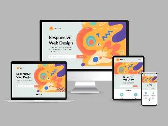
Before going ahead and learning about the technical meaning of a responsive design, let’s have a simple definition of the term. In layman’s terms, a responsive web design is about creating web pages that look good on all devices! A responsive web design will automatically adjust for different screen sizes and viewports.
Primarily, responsive website design ensures that your website works efficiently on different devices by automatically scaling the website's contents & elements to adjust according to the size of the screen on which the user is browsing it. It optimises the website's images, videos, or other content per the user's device.
However, having a mobile-friendly website in the existing scenario is necessary as there are millions of smartphone users in this world. Over 80% of online searches come from mobile devices.
A responsive website design has also replaced the earlier requirement of designing a website solely dedicated to smartphone users. There is no need to design numerous websites for different screen sizes. You can design a single website that fits according to the device screen it's being viewed on.
The main motive of a responsive design is to prevent the difficulties one faces while navigating the website on different devices, such as zooming, scrolling, resizing, panning, etc. This problem usually arises with websites that have not been optimised for numerous other devices, and this may annoy or infuriate potential consumers who want to figure out how things work here.
Read More: Basics of Responsive Web Designing
Why You Should Invest In A Responsive Design For Your Website?
Your website should be able to adapt to the different screen sizes because you never know what device a user utilises to open the website. Moreover, in 2015, Google stated that mobile-friendly websites would become a ranking component in search engine algorithms (Improve SEO). This means that websites that are not mobile-friendly will automatically fall behind in search engine results because of not being able to provide a good user experience.
As we are living in a device-saturated market, we understand the fact that websites that are unable to provide exceptional design to their users, then the chances of voice rates increase, and this might result in missing out on amazing opportunities to convert prospects into paying customers. Moreover, responsive web design is cost-effective and quite simple to manage because you only have to develop and handle just one website. This alone should be a big motivation for most of the businesses out there to implement responsive web design!
And there’s more to it, yes! You must know that Google really supports responsive websites! It's easier for Google to detect responsive as well as mobile-friendly websites and index quickly. This is so because it just has to index a single version instead of indexing separate ones for desktop and mobile devices. Also, Google is smart enough to identify any website that delivers a bad user experience and ranks them accordingly!
To sum up, here are the benefits of a responsive website design, have a look :
1) Better User-experience
2) Cost-effective
3) Improves Search Engine Optimisation
4) Allows updating the website instantly
5) The website becomes highly accessible
6) Management becomes easier
7) Actively supports link sharing on various devices
8) More Mobile Traffic
9) Lower Maintenance Needs
10) Lower Bounce Rates
11) Higher Conversion Rates
Now, let's have an in-depth look at all these points mentioned above to understand the importance of a responsive website design. Here we go!
11 Benefits Of Having A Responsive Website Design That You Should Be Aware Of:
1) Seamless User-experience
User experience is a crucial subject for every business owner, as your first objective is to make people love your website and convince them to come again & again. If a user opens your website and it doesn't cooperate with the user, such as taking forever to load videos & images, low-resolution pictures, or baseless textual data, then the user would not want to come back to the website and would find other options available for him/her.
A survey conducted by Google claimed that 48% of people think that it is unprofessional behaviour and the business is relatively irresponsible towards the requirements of the consumers. A responsive design provides a seamless user experience and helps hold on to the customers without letting them go. It positively impacts a consumer's mind, retaining them for a long time; this is what every business aims to achieve.
2) Cost-effective
Maintaining separate websites for audiences with various devices could be expensive. Opting for a responsive website design can save a lot as you only have to invest in one website to make it work efficiently on all devices.
3) Improves Search Engine Optimisation
As mentioned earlier in this article, responsive web design helps with SEO because Google gives more preferences to mobile-friendly websites. Responsive websites rank higher on search results because most of the web traffic comes from mobile devices, so Google has switched itself to mobile-first indexing. That's why, when it comes to SEO, having a responsive web design is a necessity nowadays.
Read More: The Ideal Screen Size For Responsive Design
4) Allows Updating The Website Quickly
If you cannot make the changes in a single version of your website, you will lose the chance of your website getting ranked higher. A responsive website design will help you update your website quickly, and you can make several changes to a single version of the website. It helps in saving time and money at the same time.
5) Highly Accessible
The primary website traffic comes from individual searches and when your website is handily accessible to all different kinds of devices. If the users can search everything conveniently, the business can enjoy lead conversions & generation and numerous other benefits. In simple words, a responsive design makes the website user-friendly and easy for people to navigate.
6) Easier Management
Often, businesses don't have time to refresh/update their websites. So, instead of hiring a website designer, a responsive design makes it easier to handle every part of the website smoothly as it gives you the liberty of making changes yourself quickly and effortlessly. Also, a responsive web design takes all the stress of managing the website on its shoulders, whether the links redirected will work towards getting exemplary visitors or not, or do you need to link the mobile or desktop website on an update for social media?
7) Actively Supports Link Sharing On Various Devices
A responsive website design instantly makes it easy to browse the website for a user who received a link to the website from another user who is using a different device for browsing sites. If the website is not responsive, it would be difficult for the user to view the information on the webpage, and it would be worthless.
8) Increases Mobile Traffic
The importance of mobile devices can’t be stressed enough. Today, more than half of the website traffic comes from mobile devices. Therefore, it's increasingly essential for companies to have websites that render correctly on smaller screens so that users don't encounter distorted images or experience a sub-optimal site layout.
Some businesses choose to have a different version of their website for mobile users, and a responsive web design is becoming the norm.
9) Requires Low Maintenance
If you have a different website for mobile users, then the maintenance cost for that specific website will be needed. However, you will not need additional maintenance if the website is responsive. Having separate desktop and mobile sites also necessitates two content strategies, two administrative interfaces, and potentially two design teams. Responsive design's "one size fits all" approach means fewer headaches for developers, business owners, and consumers.
10) Lower Bounce Rates
A responsive web design means the best user experience for the user. A website with a responsive design will tell the user to spend more time navigating through the website. The more time a user spends on your website, the bounce rate of your website goes down. Additionally, if your site isn't responsive, it is much harder to keep the visitor engaged and, therefore, more likely that they'll bounce off the website.
11) Higher Conversion Rates
Creating a consistent user experience across all devices is critical to converting new customers. When users decide whether to subscribe to a service, they don't want to be redirected to device-specific websites because the process often takes longer. Having a single secure website that looks professional on all platforms makes users less likely to get frustrated or turn to a competitor.
Read More: Future Of Website Design
Responsive Web Design Is Overrated, Yes or No?
As we all know, nothing is perfect, whether it is a marketing strategy or a design type. There's no exception to a responsive website design. Here are some cons of a responsive web design given below:
- The websites don't look promising on other devices.
- You may face some difficulties regarding the resizing of advertisements & banners on your website.
- On responsive websites, it may be difficult for you to provide different content to different users according to the device they opt for, which can lead to significant challenges.
Hence, these reasons shouldn't make you sceptical about having a responsive design for your website, as every design type has its disadvantages. Today, everyone prefers a responsive web design because it makes browsing websites on mobile much easier than before.
Testing A Responsive Website Design
Every one of us wants our website to look good on all devices. To help you develop an excellent responsive website design, we have developed a responsive website testing checklist, which is given below. You can visit Responsive Web Design Testing: The Beginner's Guide to learn how to do the test, the tools used for the test, tips for the test, and much more.
While designing a responsive website, we need to keep one thing in mind; responsive website testing is a continuous process as new devices are launched in the market every now & then.
Want to learn how to do responsive website testing from professionals? Watch this video and understand how responsive website testing works: https://youtu.be/Rwg-JoGahpY
In Conclusion
The trend of browsing websites using desktops/laptops has been decreasing; a vast population, including older adults, prefer smartphones over desktops. So, it has become the responsibility of every business out there to build an online presence for themselves by ensuring to opt for responsive website design. Now that we have understood the importance of a responsive website, having one for your business is imperative. And the 12Grids team is pro at creating a responsive website design. Get in touch with the experts and improve your business website.
Author

Ravindra Warang
Director - Strategy
Share
Share
Related

Web Design
How We Built a Digital Ticketing System for Mumbai Zoo— A Government Case Study
7 mins : 20 Mar 2026

Web Design
Polymers, Innovation, And A Modern Website: The Goldstab Organics Journey
5 mins : 10 Nov 2025

Web Design
From Friction to Finish Line: The God of Sports Digital Transformation
6 mins : 17 Sept 2025
Other Articles

Web Design
Screen Sizes for Responsive Design: An Expert Guide
6 mins : 26 Apr 2024

Web Design
Responsive Web Design: Understanding The Basics For Seamless User Experiences
7 mins : 29 Apr 2024
Web Design
The Future Of Responsive Web Design: Emerging Trends, Innovations And Predictions In 2026
7 mins : 17 Feb 2026