


Web Design
Screen Sizes for Responsive Design: An Expert Guide
6 mins | 26 Apr 2024
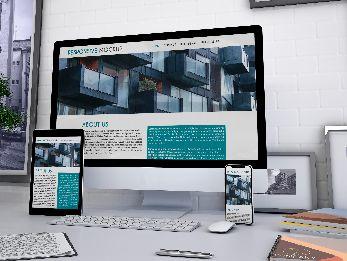
Table of content
- Introduction
- Why Responsive Web Design is Essential for Modern Sites
- Understanding Screen Resolution for Responsive Layouts
- Standard Device Dimensions & Screen Sizes
- Best Responsive Web Development Strategies for 2026:
- Final Thoughts
- Key Takeaways
Introduction
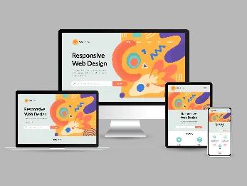
In today’s world, every internet user expects to go through a seamless experience while visiting any website on any type of device, such as smartphones, desktops, tablets, etc. This encourages web developers or designers to create designs that accommodate numerous screen sizes that are utilised globally.
In simple words, responsive design is the need of the moment! But as a web designer, you must be knowing that executing a responsive web design perfectly must begin with understanding the screen sizes that need to be designed for different devices.
In this article, we are going to explore the ideal screen size as well as general screen resolutions for a responsive web design!
Why Responsive Web Design is Essential for Modern Sites
Why is there so much buzz around the term “responsive design”? In simple terms, people are utilising different types of devices to access the internet, such as tablets, laptops, smartphones, etc. Creating a single version of web design is not the best option today! Remember that it has to be variable, and you need to consider the standard screen size of various devices.
It's not possible to know or guess what device your visitors use, and that's why you will have to craft a responsive design so that everyone can engage with your website. This way, you can make the audiences stay on your website for a longer time and convince them to keep coming back to your website. The content on the website must be engaging and easy to read; otherwise, there is a high chance of decreasing the number of visitors.
Understanding Screen Resolution for Responsive Layouts
Screen resolution means the number of pixels exhibited on a screen, which is usually denoted as “width x height”. When it comes to higher resolutions, they provide enhanced visual clarity and preciseness, but the thing is that they also necessitate better processing power from the devices. The screen resolutions that are utilised typically are full HD (1920 x 1080), 4K Ultra HD (3840 x 2160), 2K (2560 x 1440), etc. Taking all these resolutions will allow you to optimise the responsive website design for multiple devices.
Standard Device Dimensions & Screen Sizes
Here are some of the most popular screen resolutions that will help you with the process of optimising your website. Let’s have a closer look at the below-mentioned breakpoints to cater to the needs of the users!
1. Design for mobile devices from 360×640 to 414×896
2. Design for Tablets from 601×962 to 1280×800
3. Design for Desktops from 1280×720 to 1920×1080
Stay updated with industry standards and recommended guidelines for screen dimensions ranging from 360×640 to 1920×1080. However, it’s not like a fixed standard; familiarity with prevalent screen resolutions and aspect ratios can provide valuable guidance. You must strive to create a website that adjusts according to the common screen sizes in an effective manner, ensuring an outstanding user experience.
5 Best Responsive Web Development Strategies for 2026:
Designing a website for multiple screen sizes will become simpler by following the below-mentioned guidelines:
a) Understand The Breakpoints: A breakpoint can be defined as the point or juncture at which the content and design of the website will adjust in a way to offer the best user experience. In order to create a responsive website, web designers should focus on adding a breakpoint when the content seems to be misaligned. Counting on the number of devices the website is standing aligned to, multiple breakpoints should be set up in order to make sure the responsiveness of the website.
b) Create Mobile-First Approach: As smaller screens tend to experience more friction, you must prioritise designing for mobile devices first! Adapting a desktop layout to fit into a mobile viewport can be more challenging. By adopting a mobile-first approach, web designers should make sure that they include essential elements to deliver the best user experience possible.
c) Craft Fluid Designs: Fluid design means a design layout that is able to expand & contract in order to fit the viewport of the device. A static design format that distorts unfavourably when it is not perfectly aligned with distinct screen sizes. It would be best if you focused on implementing design layouts by utilising percentage units as well as maximum widths in order to maintain compatibility with the screens of mobile devices while also preventing excessive width on desktop screens.
d) Better Functionality & Less Typing: Using device functions such as biometric ID, GPS, QR code scanning, etc., is quite difficult on mobile devices when compared to desktop devices. Therefore, it is logical to decrease the dependency on typing in mobile website versions. You need to make it effortless for online users to email, share or call relevant numbers by positioning links that take action towards necessary functions. Keep in mind that optimal responsive design requires streamlining and removing unmanageable mobile interactions.
e) Reduce Friction: The design of the website should be easy to use on numerous devices. When it comes to responsive design does not just encompass what a website looks like and how it executes with regard to usability and accessibility. You must focus specifically on small-screen friction, and the reason behind this is that web elements have smaller space to render because screen sizes decrease and become more feasible to distort.
When it comes to responsive web design, it might seem challenging to execute; the best practices mentioned above seek to simplify this whole procedure for web designers as well as web developers!
By implementing the above points, it will become much easier to develop websites that will attract your target audience, regardless of the device they utilise to access the website.
Final Thoughts
In conclusion, having a good understanding of the ideal screen size for responsive design is paramount when creating user-friendly and visually appealing digital experiences across numerous devices.
By identifying the diverse landscape of devices and the preferences of the users, designers can tailor their creations in order to seamlessly adapt to various screen sizes, making sure the optimal way of displaying the content and interaction regardless of the device being utilised!
Adopting fluid & flexible design principles not only helps in enhancing usability but also future-proofs digital content, putting up with the ever-evolving technological landscape. As we continue to advance, prioritising responsive design practices remains essential in delivering engaging and accessible experiences to users worldwide.
Key Takeaways
- The ideal screen size for responsive design varies on the basis of the types of devices and user preferences.
- Consider user experience foremost, ensuring content is accessible and readable on all screen sizes.
- Fluid grids and flexible images ensure content scales proportionally, maintaining the integrity of the design.
- You need to prioritise mobile-first design in order to create efficient and user-friendly experiences on smaller screens.
- Do not forget to test designs across multiple devices & screen sizes in order to recognise and address the potential issues.
- You should keep yourself updated on evolving technologies as well as user behaviours to continue to refine responsive design strategies.
Author

Ravindra Warang
Director - Strategy
Share
Share
Related

Web Design
How We Built a Digital Ticketing System for Mumbai Zoo— A Government Case Study
7 mins : 20 Mar 2026

Web Design
Polymers, Innovation, And A Modern Website: The Goldstab Organics Journey
5 mins : 10 Nov 2025

Web Design
From Friction to Finish Line: The God of Sports Digital Transformation
6 mins : 17 Sept 2025
Other Articles

Web Design
Responsive Web Design: Understanding The Basics For Seamless User Experiences
7 mins : 29 Apr 2024
Web Design
The Future Of Responsive Web Design: Emerging Trends, Innovations And Predictions In 2026
7 mins : 17 Feb 2026

Web Design
Enhance Your Web Design Creativity with Google Web Designer
4 mins : 17 Nov 2023