ADVENT
When A Small Tweak Does Wonders
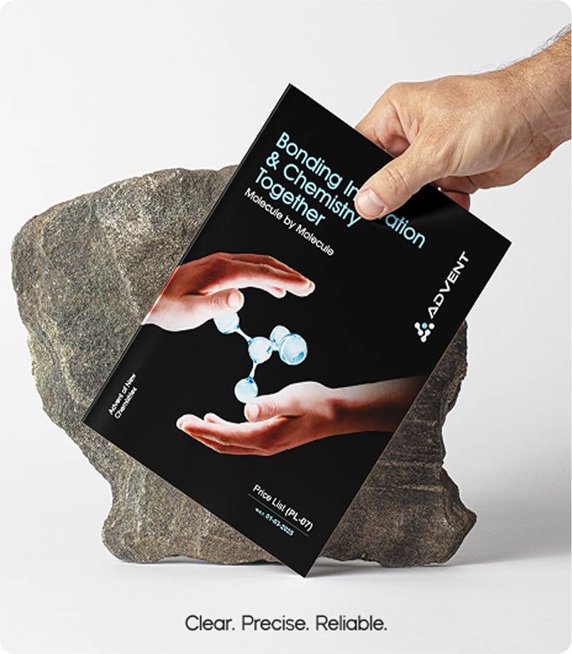
We undertook the rebranding to visually elevate the identity of Advent Chembio and align it with the brand’s growing ambition and global outlook. The color palette was updated to a bold blue, a deliberate choice to convey trust, strength, and confidence.
The logo was simplified to give it a more modern and internationally recognizable look, reinforcing our position as a forward-thinking, global brand. This rebranding also marked a shift in our brand perspective — moving from a purely functional identity to one that reflects passion, purpose, and a stronger emotional connection.
Through this transformation, we built a communication style that shows Advent as more passionate, relatable, and committed to delivering excellence.


WE Represent
Action
Transparency
Global
Bold
Trustworthy
Precision
Patterns & colors
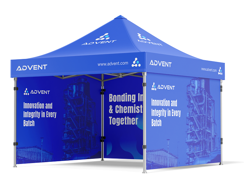
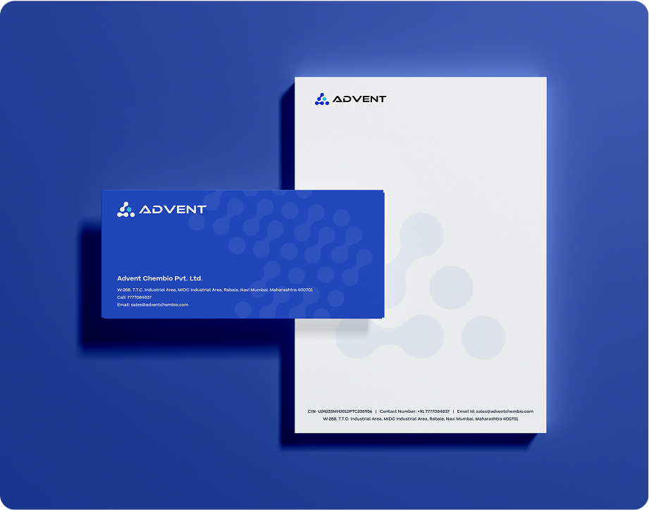
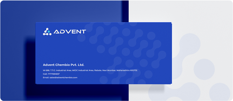
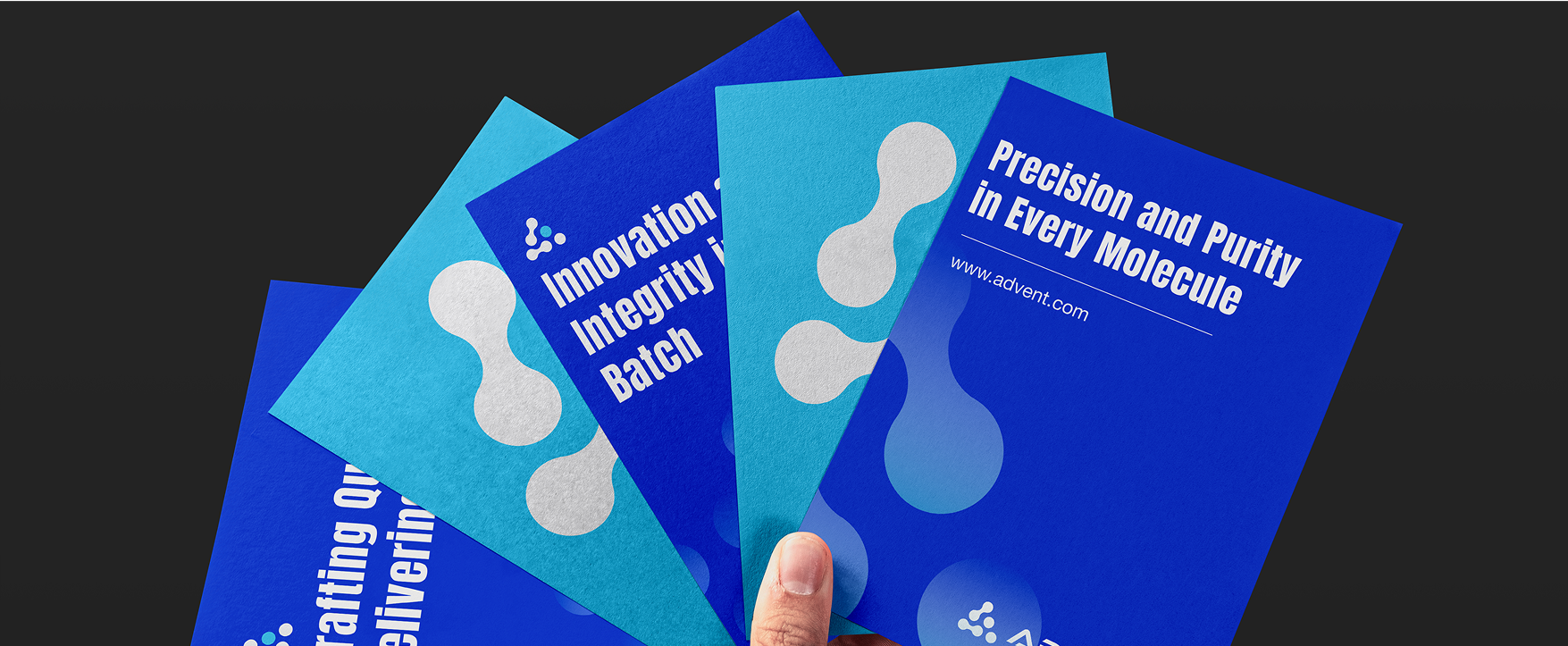
The rebranding of Advent Chembio is rooted in a bold and meaningful visual language that reflects the brand’s core values. The use of blue symbolizes innovation and trust, while the bold color palette underscores Advent’s passion for creating impactful solutions and its strength as a forward-moving brand. The visual pattern, inspired by chemical bond formations, aligns with the brand’s mission of developing new formulations and breakthroughs. By mirroring elements from the logo, the pattern reinforces brand recognition and consistency. Altogether, the design communicates a clear message: Advent is about bonding innovation and chemistry together to shape the future.


#FF0B5E
#FEB63E
#872AC4
#00B8A9
#00AEE8
#FF9F02

Bonding Innovation & Chemistry Together