


Web Design
How to Choose the Right Color Scheme for Your Website
5 mins | 08 May 2023
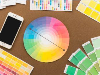
Table Of Content
Introduction
Choosing the right color scheme for your website is essential to creating a successful online presence. It is an important design element influencing how your target audience perceives your website. When users visit your website, the color scheme is one of the first things they will notice, and it can affect their overall impression of your brand.
A well-designed color scheme can help create a visually appealing and engaging user experience, while the wrong color scheme can be a turnoff for users and detract from the overall effectiveness of the website. Therefore, it is essential to give careful consideration to the color scheme when designing your website.
One of the first things you should consider when selecting a color scheme for your website is your brand identity. Your website's color scheme should be consistent with your brand identity, logo, and other branding elements. This can help create your website's cohesive and recognizable look and feel.
Another essential factor to consider when choosing a color scheme is the mood or emotion you want to convey through your website. Different colors can evoke different emotions and moods. For example, blue can create a sense of calmness and trust, while red can create a sense of excitement and urgency. Think about the mood you want to create for your website and choose colors that align with that mood.
Color theory can be a helpful tool for selecting complementary colors that work well together. This can include using colors that are opposite each other on the color wheel, such as blue and orange, or using colors that are adjacent to each other, such as green and yellow. It is essential to ensure that your color scheme has enough contrast to be easily distinguishable for people with visual impairments.
What is Color Theory?
Color theory is a set of principles used to understand and manipulate the use of color in various applications, such as art, design, and marketing. It is based on the idea that colors can be organized into a system that helps people understand how they interact with one another.
Color theory covers several aspects of color, including the color wheel, color harmony, color psychology, and color temperature. The color wheel is a visual representation of the colors in a spectrum arranged in a circular form. It helps to understand the relationships between colors, such as complementary, analogous, and triadic colors.
Choosing the right color scheme for your website is important in creating a visually appealing and engaging user experience. Here are some tips on how to choose the right color scheme for your website:
Consider your brand identity:
- Your website’s color scheme should align with your brand identity, logo, and other branding elements. This can help create your website's cohesive and recognizable look and feel. The colors used in a website should reflect the brand's identity, values, and personality. A consistent and cohesive color scheme helps to establish a strong brand identity and makes it easier for users to recognize and remember the brand.
- When selecting a color scheme for a website, designers should consider the brand's color palette and use it as a starting point. The color scheme should complement the brand's logo and other visual elements, such as typography and graphics. It is also essential to consider the target audience and their preferences when selecting colors.
Color psychology can also play a role in selecting the color scheme for a website. Different colors can evoke different emotions and feelings, and designers can use this knowledge to create a specific mood or tone for the website that aligns with the brand's message and goals.
Think about the mood you want to create:
- Different colors can evoke different emotions and moods. For example, blue can create a sense of calmness and trust, while red can create a sense of excitement and urgency. Think about the mood you want to create for your website and choose colors that align with that mood.
- For example, warm colors like red, orange, and yellow tend to evoke feelings of energy, excitement, and warmth. These colors can be used to create a sense of urgency or to grab the user's attention. Cool colors like blue, green, and purple, on the other hand, tend to create a sense of calm and relaxation. These colors can be used to create a soothing and peaceful atmosphere on the website.
Neutral colors like black, white, and gray can be used to create a sense of sophistication, elegance, or professionalism. They are often used as a background color to highlight other design elements, such as text or images.
The mood of a color can also vary depending on its saturation and brightness levels. Bright, bold colors can create a sense of excitement and vibrancy, while muted colors can create a more subtle and subdued mood.
By considering the mood of color, designers can create a color scheme that not only looks visually appealing but also aligns with the website's goals and message. It can help create a cohesive and consistent user experience, enhance the website's overall aesthetic, and ultimately improve user engagement and satisfaction.
Use color theory:
- Color theory can be a helpful tool for choosing complementary colors that work well together. This can include using colors opposite each other on the color wheel, such as blue and orange, or using colors adjacent to each other, such as green and yellow. The color theory involves various sub-divisions including color harmony and temperature. Color harmony refers to the combination of colors that are pleasing to the eye, while color psychology examines how colors can affect our emotions and behavior. For example, warm colors like red and orange evoke excitement and energy, while cool colors like blue and green create a sense of calm and relaxation.
Finally, color temperature refers to a color's perceived warmth or coolness, which can be used to create a sense of depth and dimension in an artwork or design. Overall, color theory is essential for artists, designers, marketers, and anyone who wants to understand and use color effectively.
Consider accessibility:
- It’s important to consider accessibility when choosing a color scheme for your website. This includes choosing colors with enough contrast to be easily distinguishable for people with visual impairments.
- Color contrast is an essential aspect of accessibility, and it is necessary to ensure that there is enough contrast between text and background colors to make the content legible for all users. For example, text that is too light or too small in size can be difficult to read, especially for people with visual impairments. On the other hand, high contrast between text and background colors can help improve readability.
Another important consideration is the use of color as the sole means of conveying information. For example, using red text to indicate an error or warning may be difficult for colorblind users to understand. In such cases, designers can use additional visual cues, such as symbols or patterns, to convey the information.
Designers can also use tools such as color contrast checkers and color blindness simulators to ensure that their color scheme meets accessibility standards. By considering accessibility during the design process, designers can create inclusive and usable websites for all users, regardless of their abilities or disabilities.
Test and iterate:
- Testing colors is essential in selecting the right color scheme for a website. Colors can look different on different screens and devices, and they can also appear differently depending on the lighting conditions in which they are viewed. Therefore, it is crucial to test the color scheme to ensure that it looks consistent and appealing across different devices and lighting conditions.
There are several methods for testing colors, including using color management systems, color calibration tools, and color testing software. Color management systems help ensure that colors are displayed consistently across different devices, while color calibration tools can adjust the color settings on individual devices to improve color accuracy. Color testing software can simulate how a website's colors will appear on different devices and under different lighting conditions, allowing designers to adjust the color scheme as needed.
Usability testing can also help identify any issues with the color scheme and provide feedback on improving it. User feedback can be gathered through surveys, user testing sessions, or other methods to ensure that the color scheme meets the needs and preferences of the website's target audience.
Final Thoughts
Choosing the right color scheme is an essential aspect of designing a website that looks visually appealing and engages users. A well-chosen color scheme can also help to establish a strong brand identity, convey the website's message and goals, and create a specific mood or tone.
To select the right color scheme for a website, designers should consider the brand's identity and values, the target audience, and the principles of color psychology. It is also important to consider accessibility and test the color scheme to ensure that it looks consistent and appealing across different devices and lighting conditions.
By following these guidelines, designers can create a color scheme that enhances the user experience, improves accessibility, and helps achieve the website's goals. Ultimately, choosing the right color scheme requires careful consideration, testing, and a deep understanding of the website's purpose and audience.
Author

Abhishek Sawant
Marketing Researcher
Share
Share
Related

Web Design
How We Built a Digital Ticketing System for Mumbai Zoo— A Government Case Study
7 mins : 20 Mar 2026

Web Design
Polymers, Innovation, And A Modern Website: The Goldstab Organics Journey
5 mins : 10 Nov 2025

Web Design
From Friction to Finish Line: The God of Sports Digital Transformation
6 mins : 17 Sept 2025
Other Articles

Web Design
Screen Sizes for Responsive Design: An Expert Guide
6 mins : 26 Apr 2024

Web Design
Responsive Web Design: Understanding The Basics For Seamless User Experiences
7 mins : 29 Apr 2024
Web Design
The Future Of Responsive Web Design: Emerging Trends, Innovations And Predictions In 2026
7 mins : 17 Feb 2026