


UI/UX
Chemical Website UX: 5 Patterns That Convert Visitors into Leads
7 mins | 10 Sept 2025
Introduction: Conversations That Sparked This Article
In the past year alone, I’ve spoken with over 40 chemical company leaders — from owners and CEOs to IT Heads and Marketing Managers. Their companies range from mid-sized specialty chemical manufacturers to global exporters in agrochemicals and additives.
And yet, despite different sizes and markets, I hear the same frustration again and again:
- “We have a good-looking website, but it doesn’t bring enquiries.”
- “All our datasheets, SDS, and COAs are online, but people still call us for them.”
- “We invested heavily in redesign, but leads haven’t improved.”
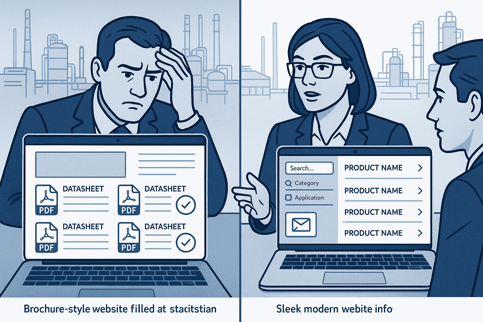
The truth? Most chemical websites are built as online brochures. They’re designed to inform, but not to convert.
Buyers in chemicals are not casual visitors. They don’t come to “explore.” They come with very specific needs: a grade, a compliance requirement, a technical spec, or a distributor query. If your website doesn’t answer these within 60 seconds, you’ve lost them.
Through our work with companies like Advent ChemBio, Goldstab, Privi Lifesciences, Decco, and UPL, we’ve learned what patterns actually move the needle. This article dives into five UX patterns that consistently convert visitors into enquiries and leads.
These are not high-level ideas. These are practical patterns you can implement with your tech, design, and marketing teams — and measure in 30–45 days. Incorporating the latest UI/UX trends for websites can also enhance visual hierarchy and usability across critical buyer touchpoints.
Pattern 1 — Make Products Easy to Find (Findability-First Design)
When a buyer lands on your website, their first question is: “Can I find what I’m looking for, quickly?”
Why Most Chemical Websites Fail Here
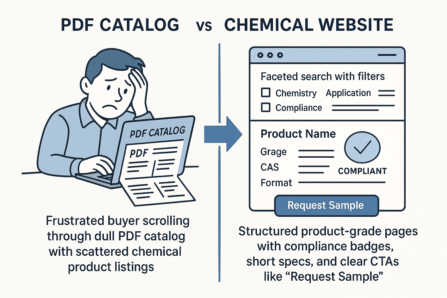
- Products are listed like catalogs in a PDF.
- Search is either missing or too basic.
- Navigation mirrors internal org charts, not how buyers think.
What Works Instead
- Buyer-friendly taxonomy
- By chemistry (e.g., Stabilizers → Phthalate-free → Food-grade)
- By application/industry (PVC, Pharma, Agro, Aroma, Coatings)
- By compliance (REACH, IFRA, FDA, RoHS, Halal/Kosher)
- Faceted search with filters for application, compliance, region.
- Dedicated product-grade pages with:
- Short description
- 5–7 key specs
- Compliance badges
- Clear CTAs: “Talk to Expert”, “Request Sample”
Story from the Field
At Advent ChemBio, buyers often abandoned the old catalog after 3–4 clicks. After re-structuring with faceted search and clean product-grade pages, buyers were able to reach the right product 60% faster. The result: enquiries rose without extra marketing spend. This aligns with the broader future of chemical websites powered by AI and automation — where user experience directly fuels lead generation.
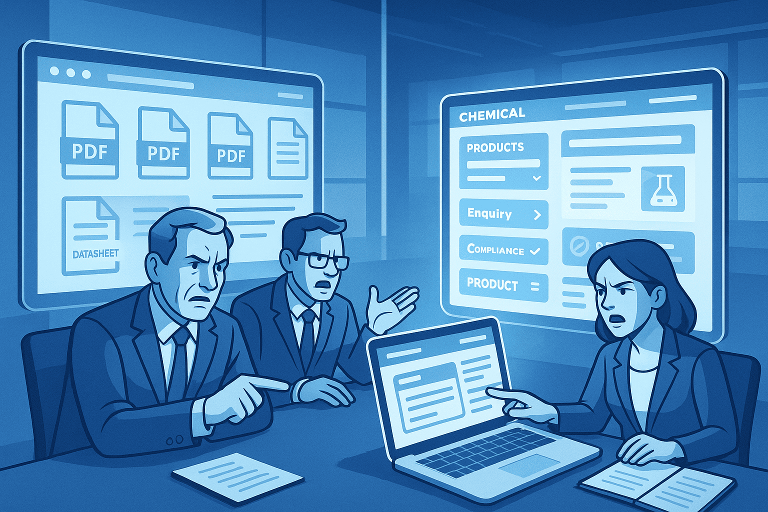
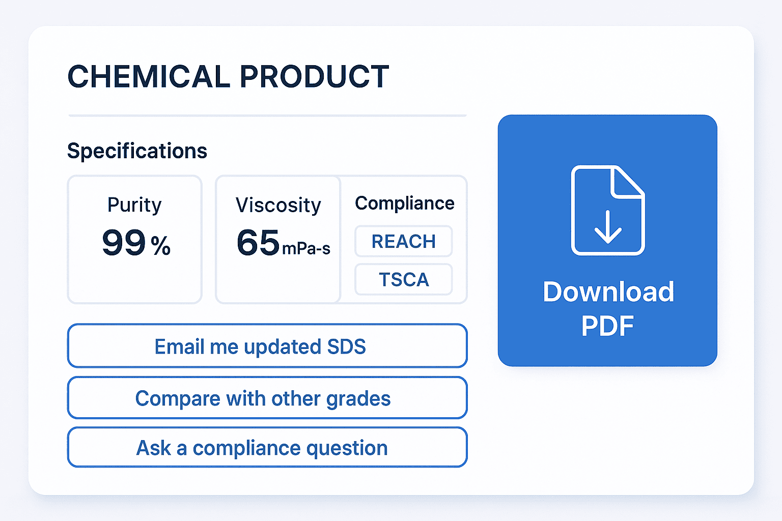
Pattern 2 — Turn Datasheets & SDS into Journeys (Not Dead Ends)
Every chemical site has SDS and datasheets. But most treat them as endpoints. A buyer downloads a PDF and disappears.
What Works Instead
- Summarize key specs on the page itself (purity %, viscosity, melting point, compliance tags).
- Offer smart actions:
- “Email me updated SDS when it changes”
- “Compare with other grades”
- “Ask a compliance question”
- Use soft gates: let them download one doc freely, then ask for email to keep them updated.
Why It Matters
- Buyers feel respected — no hard walls.
- You build opt-in connections instead of chasing them.
👉 At Privi Lifesciences, adding “Email me updated SDS” turned passive visitors into a steady stream of warm contacts, building an early stage funnel for sales.
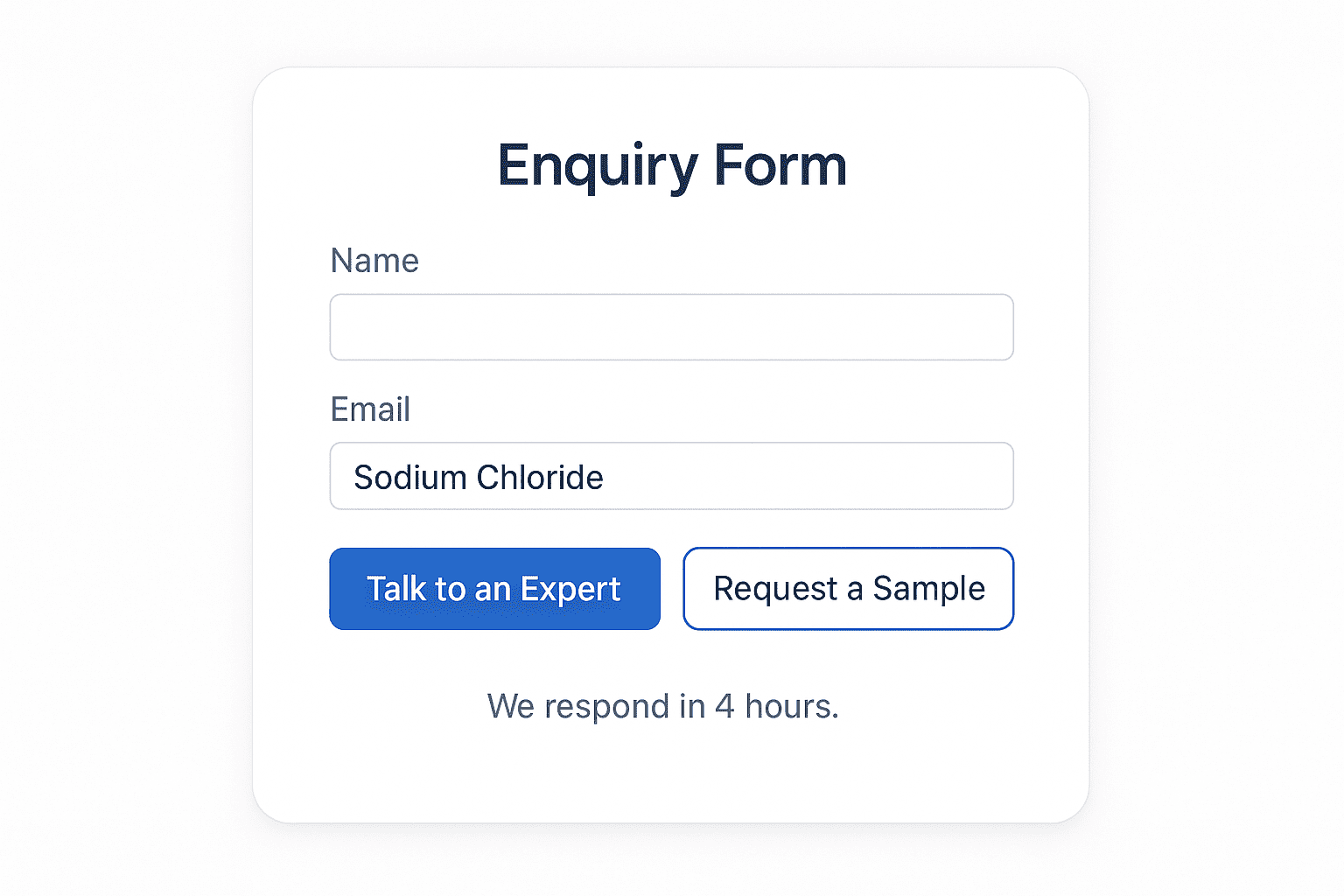
Pattern 3 — Smarter Enquiry & Sample Request Forms
This is where most chemical websites leak leads.
The Problem
- Enquiry forms are long and irrelevant.
- Buyers are forced to fill in details the company already has.
- No trust-building cues (“When will I hear back? Who’s on the other side?”).
The Fix
- Context-aware forms: Pre-fill product name and grade if user clicked from a product page.
- Two clear paths:
- “Talk to an Expert” → quick calendar booking
- “Request a Sample” → with NDA toggle + delivery info
- Trust assurance: “We respond in 4 hours. Your data is safe.”
👉 After simplifying enquiry forms for Goldstab Organics, completion rates went from 8% to 22%.
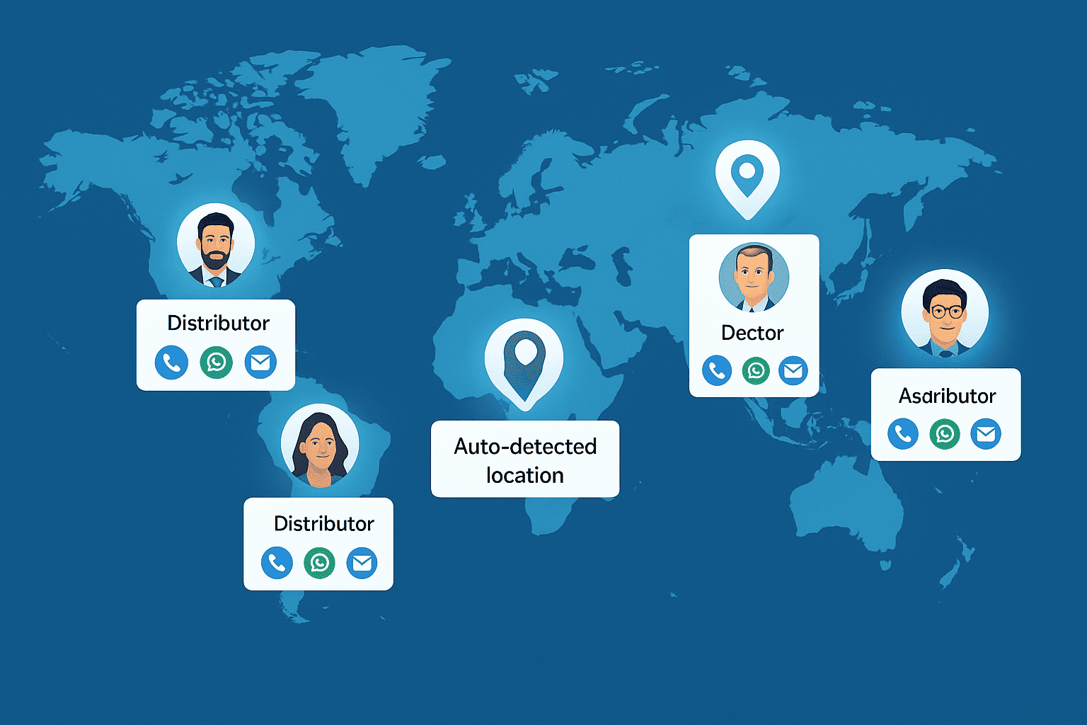
Pattern 4 — Distributor & Sales Locator That Actually Works
Many chemical companies work through distributors, but their locator tools are almost unusable.
What Works Instead
- Auto-detect buyer’s country → show nearest distributors.
- Let users filter by application or industry.
- Show real people with names/photos (where policy allows), response times, and contact buttons (call, WhatsApp, email).
- If no distributor exists: “We’ll connect you directly with our central team.”
This small change builds trust and routes serious intent to the right human quickly.
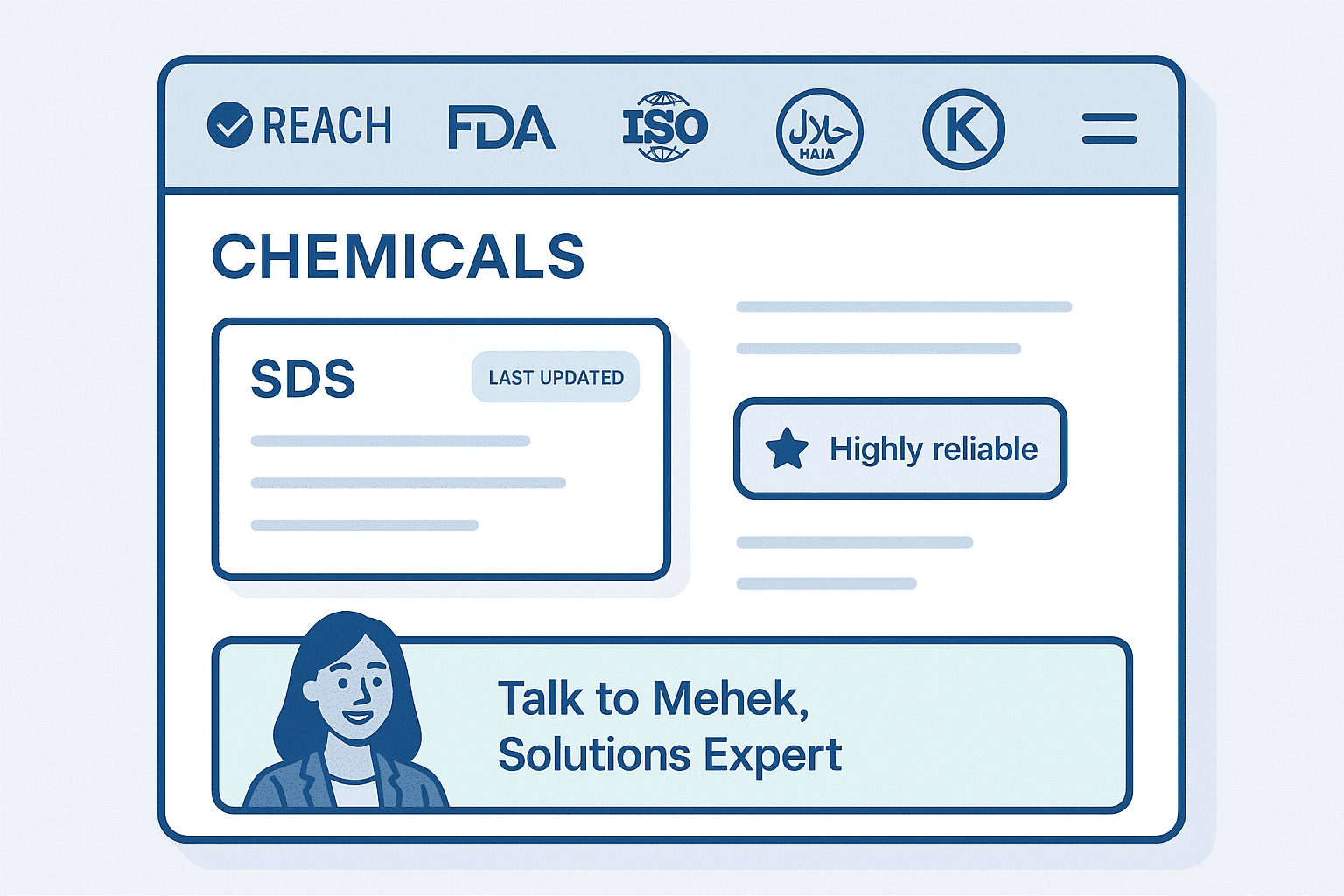
Pattern 5 — Build Trust Into Every Page
Chemical buyers care deeply about compliance, quality, and reputation. Your website must reflect that at every touchpoint. You can further boost conversion by leveraging content marketing to build brand trust online, especially near CTAs and product pages.
Trust-Building Elements
- Visible compliance badges (REACH, FDA, ISO, Halal, Kosher).
- Show “Last Updated” dates for SDS and COAs.
- Short testimonial chips or case-study snippets: “Cut qualification time by 30%.”
- Human contact banner mid-page: “Exploring options? Book 20 minutes with Mehek, Solutions Expert.”
👉 At UPL, adding trust signals near CTAs improved click-through rates by 18%.
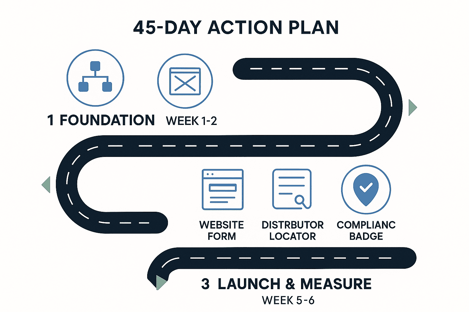
Action Plan: Implementing in 45 Days
Here’s a practical roadmap chemical companies can follow:
Week 1–2: Foundation
- Map your product taxonomy around buyer logic.
- Draft wireframes for product pages and datasheet journeys.
- Identify top 5 compliance badges to display consistently.
Week 3–4: Build & Integrate
- Implement faceted search with synonyms.
- Create structured product-grade pages.
- Add smart enquiry forms and sample flows.
- Build distributor locator with real contact details.
Week 5–6: Launch & Measure
- Add compliance + trust blocks to all product pages.
- Publish 2 case-study snippets to use as proof.
- Set up GA4 to track:
- Time-to-product
- Datasheet opt-ins
- Enquiry completion rates
- Run A/B test on CTA placement.
👉 Within 45 days, you’ll have moved from a brochure website to a conversion-ready growth engine.
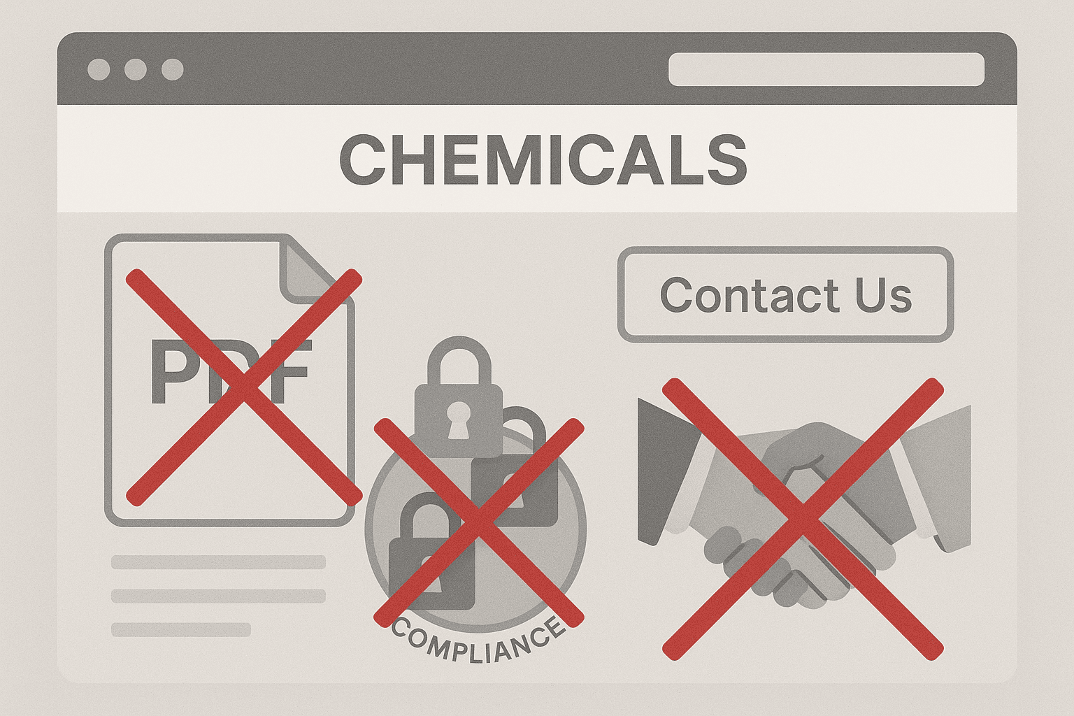
Common Anti-Patterns to Avoid
- Dumping all products in a single PDF.
- Using “Contact Us” as the only CTA.
- Hiding compliance info behind 5 clicks.
- Showing stock visuals that scream “generic trading company.”
Conclusion: From Information to Impact
Every chemical leader I’ve spoken to wants the same thing: visibility and leads. But too many still expect their website to perform while it’s designed like a brochure.
The solution isn’t more ads or flashy visuals. It’s better UX patterns that respect how chemical buyers think, search, and decide.
Get these five patterns right, and your website will stop being a silent catalog and start working as a growth engine.
That’s the future we’re building at 12Grids — one website at a time.
👉 Check out some of the best-performing chemical manufacturing websites already implementing these UX patterns effectively.
Author

Ravindra Warang
Director - Strategy
Share
Share
Related
UI/UX
AI-Powered UX Design : How to Build Digital ProductsThat Learn From Your Users
9 mins : 17 Apr 2026
_desktop_list_webp_2325ad4d.webp&w=640&q=75)
UI/UX
How to Choose a UI/UX Design Agency in India(Without Getting Burned)
8 mins : 23 Mar 2026

UI/UX
UX Audit: How to Know Your Website Is Losing Customers(And Exactly How to Fix It)
7 mins : 17 Mar 2026
Other Articles

UI/UX
How UPL Built a Unified Digital Identity Across 140 Countries – And What Brands Can Learn From It
3 mins : 26 Nov 2025

UI/UX
Top 9 UI/UX Trends to watch out in 2026
6 mins : 10 Feb 2026
_desktop_list_webp_cf6f183b.webp&w=640&q=75)
Marketing
Kadambari Bendre recognised among 10 Best Marketing Leaders in India 2026
2 mins : 05 May 2026