


Web Development
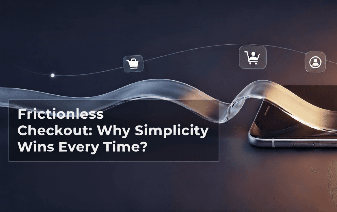
Frictionless Checkout: Why Simplicity Wins Every Time?
5 mins | 18 Sept 2025
Picture this: you’ve found the perfect pair of running shoes online. You’re excited to finally replace the worn-out ones sitting by the door. You click “Buy Now,” but then… you’re faced with five different pages, a dozen form fields, and a login requirement you don’t remember creating. Suddenly, the excitement fades. Maybe you’ll try again later. Or maybe you’ll close the tab.
This is exactly what was happening on the God of Sports (GoS) website before their transformation. Customers loved the products, but the checkout process felt like running a marathon with hurdles at every turn. That friction cost GoS sales, trust, and repeat customers.
When 12Grids stepped in, they knew the key to fixing this wasn’t flashy design, it was respect for the customer’s time and attention. A checkout process shouldn’t be a test of patience. It should be invisible: quick, simple, and effortless. Here’s how 12Grids made it happen and why every brand should follow their lead.
The Checkout Problem: Too Many Clicks, Too Much Effort
Before the revamp, GoS’s checkout was bloated. Shoppers had to create an account, enter lengthy personal details, confirm shipping multiple times, and navigate through unclear payment pages. Each extra step created a moment for second thoughts or distractions. Data across industries backs this up: every unnecessary field or page increases cart abandonment rates. A distracted shopper might receive a message, get called away, or decide to compare prices elsewhere. When friction creeps in, even the most motivated buyer can bail.
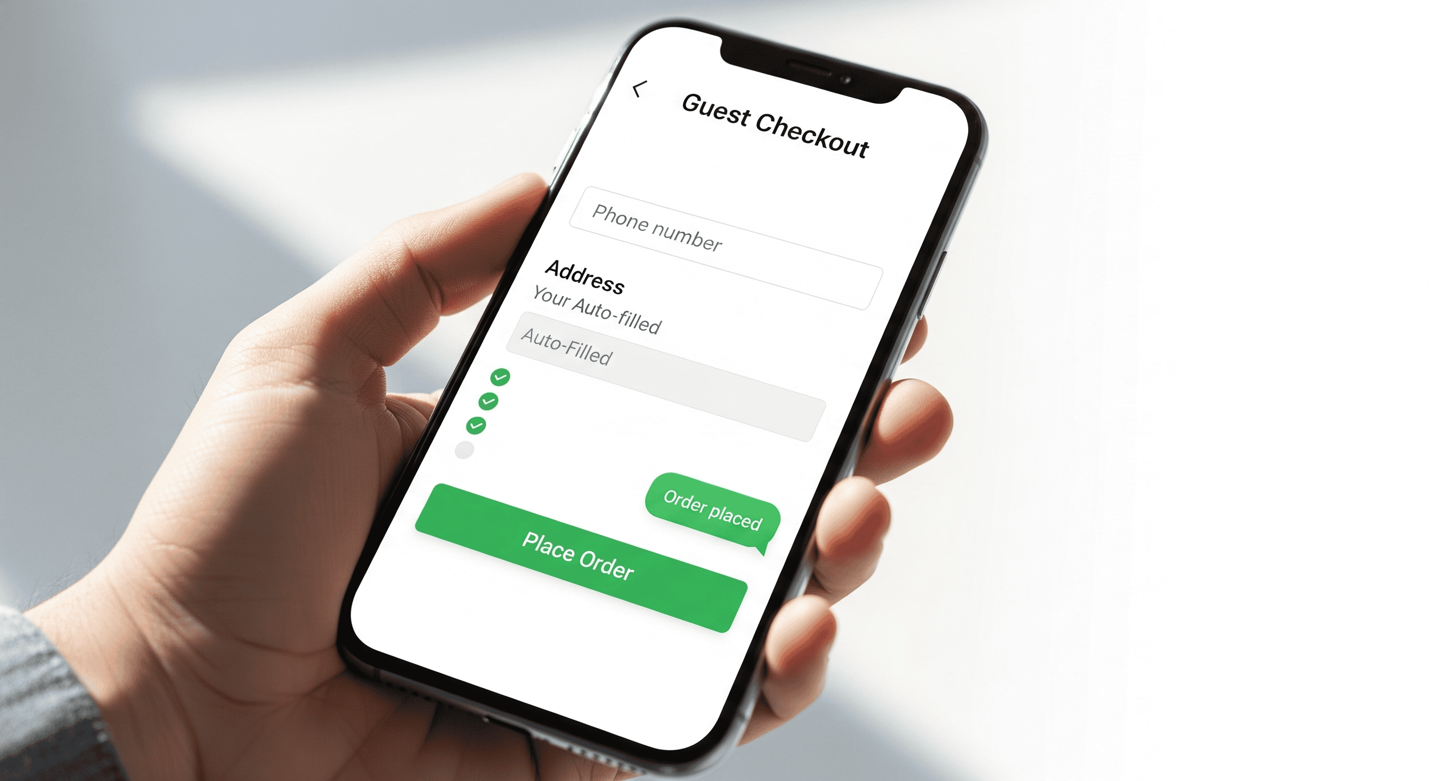
The Fix: Guest Checkout With Just A Phone Number
12Grids cut through the clutter by introducing guest checkout. No mandatory accounts. No endless forms. Customers could simply enter a phone number, make their payment, and be done. This small change immediately lowered the barrier to purchase, especially for first-time buyers who weren’t ready to “commit” to creating an account.
This approach also resonated with the Indian market, where mobile numbers are a natural ID. It felt familiar and intuitive — no need to hunt for passwords or type out long email addresses on small screens.
WhatsApp Integration: Updates Where Customers Already Are!
The team didn’t stop at simplifying forms. They integrated Business WhatsApp into the checkout process. Instead of forcing customers to log into a website or check email for updates, GoS sent confirmations, shipping details, and delivery notifications straight to WhatsApp.
Why does this matter? Because people already check WhatsApp multiple times a day. By meeting customers in their comfort zone, GoS reduced anxiety about orders and made the whole experience feel personal. Even resolving a question like “Can I change the delivery address?”, became as easy as texting a friend.
This conversational approach transformed a transactional step into a relationship-building moment. Customers didn’t just feel like buyers; they felt connected to the brand.
Designing For Speed And Clarity
Checkout speed isn’t just about internet connection, it’s about how quickly customers can understand what to do next. 12Grids redesigned GoS’s checkout screens with clean layouts, clear buttons, and straightforward language. They removed clutter, used bold visuals to highlight actions, and ensured mobile screens were easy to navigate with one hand.
The result? A checkout flow that felt less like a process and more like a natural conclusion to shopping. Fast-loading pages reinforced trust. Customers didn’t have to second-guess whether their payment went through or if the site had frozen.
Why Simplicity Sells?
Every extra click is a chance for doubt. Every confusing label is an invitation to leave. Simplicity isn’t just a convenience, it’s a competitive advantage. In today’s crowded online marketplace, people gravitate toward brands that value their time.
When GoS reduced checkout friction, they didn’t just improve conversions. They sent a message: “We respect your time, and we’re here to make your experience easy.” That respect builds loyalty. Shoppers who have a smooth, stress-free experience are far more likely to come back and recommend your brand to friends.
Applying These Lessons to Any Business Can Increase Conversion!
You don’t need to be in sports retail to benefit from frictionless checkout. Here are practical steps you can take:
- Audit Your Checkout Flow: Go through your own process as if you’re a first-time customer. How many steps feel unnecessary?
- Offer Guest Checkout: Don’t force people to create accounts before they’re ready. Give them the option to buy now and sign up later.
- Integrate Familiar Channels: Whether it’s WhatsApp, SMS, or another platform your customers use daily, bring updates to them instead of making them search for information.
- Streamline Payment Options: Support popular methods and minimize redirects. Fewer steps equal fewer chances to lose a sale.
- Optimize For Mobile: Many shoppers will complete purchases on their phones. Make sure buttons are easy to tap and text fields are easy to fill.
- Use Clear Language: Replace “Proceed to Confirmation Step” with something like “Place Your Order.” Clarity reduces hesitation.
In Conclusion
Many companies focus on branding at the top of the funnel, ads, social media, and product pages. But the checkout page is just as important. It’s the last impression a customer gets before becoming a buyer. If that moment feels frustrating, it can overshadow all the great design and messaging that came before.
God of Sports proves that simplicity is powerful. By removing friction, they didn’t just recover lost sales, they created a checkout experience that matched their mission: to make professional sports gear accessible to everyone. When your buying process reflects your values speed, trust, and care — customers notice and they come back!
Author

Manasvi
Assistant Marketing Manager
Share
Share
Related
_desktop_list_webp_d12ff3cb.webp&w=640&q=75)
Web Development
How Much Does AI Website Development Cost in India 2026 Real Numbers | Every Feature Priced
15 mins : 22 Apr 2026
Web Development
How to Build an AI-Powered E-commerce Store in India : What Actually Increases Sales (2026 Guide)
9 mins : 15 Apr 2026

Web Development
AI Chatbot for Your Website & WhatsApp:The Complete Buying Guide for Indian Businesses (2026)
8 mins : 09 Apr 2026
Other Articles

Web Development
AI-Enabled Website Development in India: What It Actually Means, What It Costs, and What to Avoid
9 mins : 31 Mar 2026

Web Development
Custom Website vs. WordPress vs. Shopify:What Indian Businesses Actually Need
8 mins : 30 Mar 2026

Web Development
Your Website is Invisible to AI - Here's the 7 Pillar Fix (2026 Guide)
10 mins : 18 Feb 2026